`5px` of padding is the visible dark frame around the screen. Notice `borderRadius` here is `outerRadius`, not `outerRadius + 1` — the outer wrapper gets `+1` to avoid a visual gap between the bevel ring and the body where the gradient might bleed through.
`innerRadius` is `outerRadius - 5` — matching the 5px padding offset. This keeps the inner corners visually concentric with the outer ones. Without this, the screen corners appear too sharp or too round relative to the frame.
### Ambient shadows
A single `box-shadow` looks artificial — the falloff is a crisp edge rather than a natural penumbra. We stack nine layers, each progressively lighter and more diffuse:
```js
const ambientShadows = [
"0 1px 2px rgba(0,0,0,0.15)",
"0 2px 4px rgba(0,0,0,0.12)",
"0 4px 8px rgba(0,0,0,0.10)",
"0 6px 12px 2px rgba(0,0,0,0.08)",
"0 8px 16px 4px rgba(0,0,0,0.06)",
"0 12px 24px 6px rgba(0,0,0,0.05)",
"0 16px 32px 10px rgba(0,0,0,0.04)",
"0 24px 48px 16px rgba(0,0,0,0.03)",
"0 32px 64px 24px rgba(0,0,0,0.03)",
]
```
Each step doubles the blur, adds more spread, and halves the opacity. The result is a soft, real-looking shadow that falls off the way light actually does. This is passed as the `box-shadow` property alongside the edge shadows we'll add in Layer 6.
---
## Layer 2: The Screen
The screen wrapper does two things: clips the image to the rounded shape, and adds a depth ring:
```jsx
{/* Screen inset shadow */}
```
`overflow: hidden` does the border-radius clipping on the image — the image itself doesn't need a `borderRadius` because the container clips it.
Without an image yet, we can see the screen container clipped to the frame:
`lineHeight: 0` is non-obvious but essential. Images are inline elements by default, which means the browser reserves space below them for text descenders — about 4px of empty space at the bottom of the container. Setting `lineHeight: 0` on the wrapper collapses that. Without it, the image floats slightly above the bottom of the frame.
### Height calculation
We need to maintain the real iPhone aspect ratio. The iPhone 17 Pro is 2622 × 1206 pixels — a ratio of roughly 2.175:1. We derive height from width:
```js
const height = Math.round(width * (2622 / 1206))
```
Pass a `width` prop and height follows automatically. Hardcoding a height would break the proportions the moment someone changes the width.
The inset shadow overlay sits at `zIndex: 2` above the image. It's a dark ring that recesses the screen into the bezel — the difference between a screen that looks flush and one that looks embedded.
---
## Layer 3: The Dynamic Island
Three concentric circles faking lens depth:
```jsx
// notchW = width * 0.33, notchH = width * 0.09
{/* Camera lens — outer housing */}
{/* Lens inner ring */}
{/* Specular highlight — covered in Layer 6 */}
```
`borderRadius: 999` on the island container is intentional. A value large enough — larger than half the element's height — always produces a perfect pill shape regardless of the element's actual dimensions. No need to recalculate as width changes.
The radial gradients are positioned off-center (`35% 35%`, `40% 40%`) to simulate a fixed light source above and to the left. Moving the gradient center away from `50% 50%` shifts the bright spot, making the glass appear to have a real angle relative to the light.
The `zIndex: 1` on the island positions it above the image but below the shine overlays (`zIndex: 2`). The Dynamic Island is part of the device, not a reflection.
Building it up in three steps — pill, lens housing, inner ring with specular:
---
## Layer 4: The Glass Layers
Two overlays simulate screen glass. Both sit at `zIndex: 2`.
### Sharp diagonal glint
```jsx
```
The trick here is the negative positioning. Setting `top/left/right/bottom` all to `-25%` makes this div 50% larger than its parent in every direction. The parent has `overflow: hidden`, so only the portion that falls within the screen bounds is visible.
Why bother making it oversized? So we can rotate and translate it without revealing transparent corners. When the tilt physics move this overlay (Layer 6), it needs room to slide without the edge becoming visible.
The gradient has two colour stops at the same percentage: `rgba(255,255,255,0.08) 35%` and `rgba(255,255,255,0) 35%`. Same position, different values — that's how you get a hard edge in a CSS gradient. No transition, just a sharp cut.
### Soft ambient wash
```jsx
```
Gentler falloff, slightly different angle. This adds the ambient diffusion that sits behind the glint — making the top-left corner of the screen look softly lit rather than just adding one bright stripe.
---
## Layer 5: Making it Move
State and ref:
```js
const containerRef = useRef(null)
const [tilt, setTilt] = useState({ rotateX: 0, rotateY: 0 })
```
The core function normalises pointer position to −1..1:
```js
function tiltFromPoint(clientX, clientY) {
const rect = containerRef.current.getBoundingClientRect()
// Convert absolute viewport coords to element-local, then normalise to -1..1
const x = ((clientX - rect.left) / rect.width) * 2 - 1
const y = ((clientY - rect.top) / rect.height) * 2 - 1
setTilt({
rotateX: -y * MAX_TILT, // pointer at top → tilt top toward viewer
rotateY: x * MAX_TILT, // pointer at right → tilt right
})
}
```
`getBoundingClientRect()` returns the element's position in the viewport. Subtracting `rect.left` converts from viewport-absolute to element-local coordinates. Dividing by `rect.width` normalises to 0–1. Multiplying by 2 and subtracting 1 shifts to −1..1.
`rotateX: -y` is the axis inversion. When the pointer is near the *top* of the element, the top of the phone should tilt *toward* you — that's a positive `rotateX` in CSS 3D space. But `y` is negative at the top (above centre), so we negate it.
The transform:
```js
transform: `perspective(800px) rotateX(${tilt.rotateX}deg) rotateY(${tilt.rotateY}deg)`
```
`perspective(800px)` is the simulated camera distance. Smaller values increase the foreshortening effect — 400px looks dramatic, 1200px looks nearly flat. 800px hits the sweet spot for a phone-sized element.
`transformStyle: "preserve-3d"` propagates the 3D context to child elements. Without it, all the children collapse to the same plane and depth ordering breaks.
`willChange: "transform"` is a GPU hint — promotes the element to its own compositing layer before any animation starts, avoiding a repaint on first move.
Touch support uses the same function:
```js
function handleTouchMove(e) {
const touch = e.touches[0]
if (touch) tiltFromPoint(touch.clientX, touch.clientY)
}
```
`e.touches[0]` is the first touch point. `clientX` and `clientY` are the same coordinate space as mouse events, so `tiltFromPoint` handles both.
---
## Layer 6: Edge Extrusion and Shine Physics
When you tilt a physical phone, you see its edges. We fake this with offset `box-shadow`:
```js
const edgeX = -(tilt.rotateY / MAX_TILT) * EDGE_DEPTH
const edgeY = (tilt.rotateX / MAX_TILT) * EDGE_DEPTH
const edgeShadows = Array.from({ length: EDGE_LAYERS }, (_, i) => {
const t = (i + 1) / EDGE_LAYERS
return `${edgeX * t}px ${edgeY * t}px 0 0 #222`
})
```
When `rotateY > 0` (tilting right), `edgeX` is negative, shifting the shadow left — which makes the left edge appear to protrude. Two stacked layers (`EDGE_LAYERS = 2`) with progressive offsets give soft depth rather than one sharp step.
The blur radius is `0` — these are solid-colour shadows, not diffuse. They're edge geometry, not light scatter.
The glass shine overlays also react to tilt:
```js
const shineX = -(tilt.rotateY / MAX_TILT) * SHINE_MAX_OFFSET
const shineY = (tilt.rotateX / MAX_TILT) * SHINE_MAX_OFFSET
const lightAlign = (-tilt.rotateY + tilt.rotateX) / (2 * MAX_TILT) // -1 to 1
const shineOpacity = Math.max(0, Math.min(1, 0.5 + lightAlign * 0.5))
const shineAngle = 155 + (tilt.rotateY / MAX_TILT) * 5 // ±5° rotation
```
`lightAlign` measures how much the screen's normal vector aligns with the fixed top-left light source. Tilt the top-left corner toward the viewer and `lightAlign` increases, brightening the shine. Tilt it away and the shine fades.
`shineX/Y` slide the oversized shine overlay in the direction opposite to tilt — the reflection appears to hold still relative to the light source while the glass moves beneath it.
The specular highlight inside the camera lens follows the same values:
```jsx
```
At rest it's at `top: 20%, left: 25%` — off-center, simulating a fixed light above-left. As the device tilts, it moves, maintaining the illusion of a consistent light source.
---
## Accessibility
One `useEffect` respects `prefers-reduced-motion`:
```js
useEffect(() => {
const mq = window.matchMedia("(prefers-reduced-motion: reduce)")
setReducedMotion(mq.matches)
const handler = (e) => setReducedMotion(e.matches)
mq.addEventListener("change", handler)
return () => mq.removeEventListener("change", handler)
}, [])
```
We listen for runtime changes, not just the initial value — users can toggle system preferences while the page is open. When `reducedMotion` is true, `tiltFromPoint` returns early. The transition CSS is still present but never fires.
---
## All Together
Six layers, each handling one physical phenomenon:
| Layer | What it simulates |
|-------|-------------------|
| Bevel gradient | Metallic edge catching light |
| Dark casing + ambient shadow | Matte body with natural depth |
| Screen clip + inset shadow | Glass recessed into frame |
| Dynamic Island | Camera hardware |
| Sharp + soft shine overlays | Specular and ambient glass reflection |
| JS tilt + edge shadows + shine physics | Device orientation and light interaction |
The key insight: physical objects fool the eye by accumulating subtle cues. A single gradient isn't convincing. A single shadow isn't convincing. But six layers, each doing their specific job — bevel, shadow falloff, depth ring, glass glint, edge geometry, reactive shine — combine into something the brain reads as solid.
You can see the full component on the [apps page](/apps).
---
## Update: Side Buttons
*3 March 2026*
The mockup was missing one detail that real phones have — hardware buttons on the sides. Three on the left (action button, volume up, volume down) and a power button on the right.
The buttons are absolutely positioned inside the perspective container, sitting just outside the bezel edge. Each one is a thin rectangle with a metallic gradient, rounded on its outward-facing corners:
```jsx
const btnW = Math.max(2, Math.round(width * 0.013))
const buttons = [
{ side: "left", top: 0.155, h: 0.032 }, // Action button
{ side: "left", top: 0.215, h: 0.06 }, // Volume up
{ side: "left", top: 0.29, h: 0.06 }, // Volume down
{ side: "right", top: 0.22, h: 0.08 }, // Power
]
```
Positions and heights are expressed as fractions of the total phone height, so they scale proportionally with the `width` prop. At the default 218px width, each button is about 3px wide — subtle but visible.
The interesting part: the buttons react to tilt. On a real phone, you only see the side buttons when the edge faces you. Here, each button's opacity is tied to the tilt direction that reveals its side:
```jsx
// Left buttons brighten when tilting right (left edge faces viewer)
const leftOpacity = 0.3 + Math.max(0, tilt.rotateY / MAX_TILT) * 0.4
// Right button brightens when tilting left (right edge faces viewer)
const rightOpacity = 0.3 + Math.max(0, -tilt.rotateY / MAX_TILT) * 0.4
```
Base opacity is 0.3 so they're always faintly visible, rising to 0.7 at full tilt. The transition follows the same 300ms ease-out as the rest of the tilt system, so it feels physically connected.
---
# Three years of AI
My first record of coding with AI was in March 2023 when I was poking around with ChatGPT.
category: Reflection
date: 2026-02-22
reading-time: 17 min read
url: https://conor.fyi/writing/three-years-of-ai
---
*I wanted to do a write up on this stuff to mark one year of using ClaudeCode. This document is just me logging, mostly for myself, an intense few years of working with AI tools as a software maker. If you're reading this - thanks for having a look and I hope it's somewhat interesting. I'm not using any AI to write it, review it, or suggest any ideas for it.*
My first record of coding with AI was in March 2023 when I was poking around with ChatGPT and wanted to experiment with their API, where you could send a payload and get a response. I was interested in learning Rust at the time too so I killed two birds with one stone and "paired" with Chippity to hack up [a little web-app](https://github.com/conorluddy/weather-haiku).
It took the weather forecast from the Yr.no API and sent it to the GPT API to get converted into a haiku with a little serverless function. I had no idea I'd be heavily using Anthropic's Haiku model a year or two later. I'm glad I have an actual record in a public repo of my first crack at it because it was technically my first time paying for LLM tokens.
After that I started yet another portfolio website that never got completed, but I was using ChatGPT to help me build a static web framework with Rust, with the goal being that it would work with web components and do some magic with CSS and bundling. It never really had a clear goal and never got completed.
The next big timeline event for me was in April 2024 when I was hit by tech layoffs. At the time when I was laid off I had been in this career for 18 years. It's never fun being laid off, and this was my second time, but that fresh start mentality had me considering career changes. Wedding and real estate photography were up there as serious ventures and I already have more than enough serious photo gear to go down that path without needing to spend more, and I was ready to get away from desk work.
At the time I was on a digital detox buzz after reading Digital Minimalism by Cal Newport, and had been using my phone in black and white for months to kill the habit of unconsciously unlocking it. It's a very effective way to do it.

Luckily, I opted to by myself a new Macbook and start taking side projects a bit more seriously instead. In hindsight that layoff was probably the best thing that happened to me during this AI revolution - the timing was perfect, because I started building things just as OpenAI, [Cursor](https://www.cursor.com) and Anthropic were getting really good.
Around the time I was laid off I started following YouTubers like Pieter Levels and Marc Lou, and Marc's [shipfa.st](https://www.shipfa.st) product got me thinking that I should build a boilerplate repo that I'd use as a jump-off for all of these other products I was going to start building. Youtube Premium is one of the things I kept even when unemployed - it's very underrated.
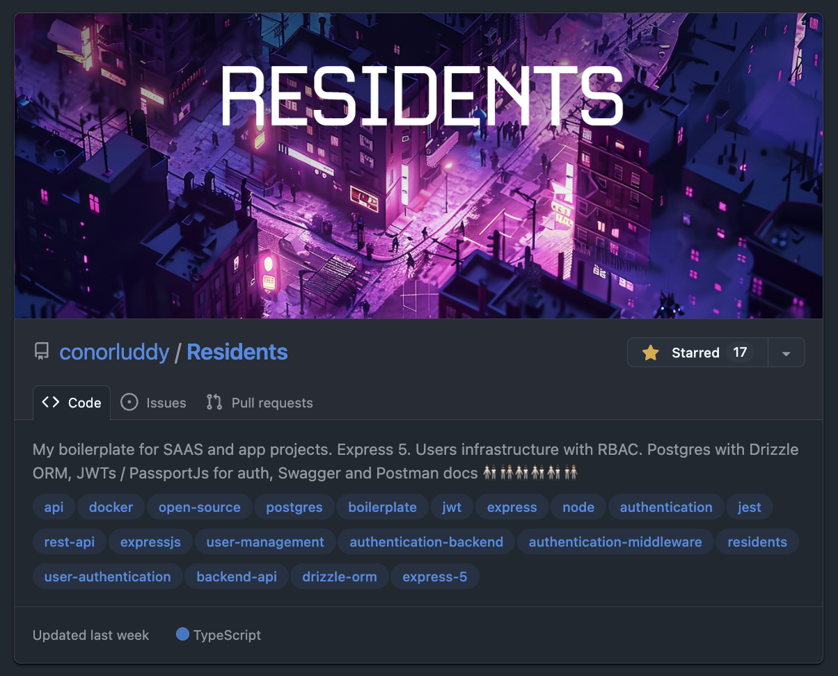
I had never built a backend setup with user auth from scratch before, and I suddenly had a lot of free time, so I started building [Residents](https://github.com/conorluddy/Residents). The motive being that most apps and products will need to manage users, so lets build the lowest-common-denominator backend API that I can reuse like a cookie cutter.
I learned a bunch about auth, Express, middleware, JWTs, refresh tokens, security, role based access and API testing. The satisfying part about building this was that I was the only person working on it, so had the freedom to make it fully Typescript typed, and well covered by tests.
At that point I would have been discussing the codebase with Chippity (I just searched in my ChatGPT dashboard and I had set up one of those custom GPTs and called it "ResidentOne"). I was zipping up code repositories and uploading them as an asset for the GPT, using it to get feedback on the code and advice on how to do auth securely, and then iterating that way.
I'm still maintaining Residents, and it's a special one for me because it has been through every phase of my AI journey so far. Starting with Chippity, then Cursor and Continue, and now being occasionally updated by the latest Claude models. It's likely the last ever repository I'll ever have coded the majority of "by hand", because it's no longer efficient to do that.
Despite planning to take a few months off and decide what to do next, I ended up starting a new job with [Nory.ai](https://nory.ai) in May '24. I got busy in there very quickly and the personal side products slowed down to a crawl, but I was gradually building a wedding portal website for a friend and designing and building a NextJS-Wordpress website for a Dental clinic.

Actually while looking at that site again to get this screenshot, I remembered that AI helped me to find some unusual ways to do scroll tracking and responsive visibility with native CSS variables.
In trying to piece this timeline together, I dipped into my emails and found a "Making the most of Cursor" email from 4th September 2024, followed by a "Receipt from Anthropic" 14 days later. Cursor is a great product, but it was the Claude/Sonnet API that was doing the AI work, so I never ended up subscribing to Cursor - I went straight to the source and I've been an Anthropic customer since.
There was (and still is) a VSCode plugin called [Continue](https://continue.dev), that you could use to get a similar setup to Cursor, with a chat panel in the IDE that you use to specify files or lines of code to pass to Claude, and this became my daily driver at work and at home. Rather than paying a fixed subscription to Cursor I was just paying directly for token usage from Anthropic.
Nory.ai are obviously a product company who lean into AI and using these tools in there was encouraged. That's where I'd start to really notice the rift between engineers who were leaning into it and those who had no interest in using it.
I used to share things on Slack in work when I found useful or interesting ways of working with AI while coding. I remember writing up at the time about how pairing with AI gets you into the flow-channel quicker. The flow channel is a theoretical graph that you can Google, with Challenge on the Y axis and Skill on the X. When you're working "in the zone" in the sweet spot of skill and challenge, anxiety and boredom are minimised and you get very focused. AI tooling can augment your skills and reduce most challenges, so I always found it got me into that flow super quick.
At this point I was still in chatbot territory, with Continue making code changes to files from within VSCode. Agentic coding with ClaudeCode hadn't arrived yet, but there was (and still is) a tool called [Aider](https://aider.chat) that gave AI command line access in a similar way. I'm still on that same Macbook, so I can just ask Claude to check the file system and figure out when I installed that...
*"Aider was first installed on October 19, 2024"*
-- ClaudeCode
At the time when I was trying it out we had a little bit of tech debt in the frontend code in Nory. I recorded a Loom video of me using Aider to decompose a React component into 12 smaller React components. Not complicated work, but definitely repetitive and time consuming, creating prop types for them all and extracting shared code etc.
I shared the video thinking it was awesome what could be done with Aider. I think I only had a couple of replies, one being "Command line access for AI - what could go wrong...".
At the same time our head designer in there was loving Cursor and giving us a dig out with updating our design system tokens in the codebase. It was interesting to see how some engineers shun away from AI tooling while some designers jump in head-first.
Back over in side-project territory I had started building a gym app I was calling [Afterset](https://apps.apple.com/us/app/afterset/id6756236020) (named that because that's when you log your set.). I realised I could also use AI to generate data for muscles and exercises - not just write code. So now it was trivial to create hundreds of exercises and get AI to define what proportion of each exercise would hit each muscle. A recurring theme with working with AI is that the more you use it the more "oh you can do THAT with it too" ideas naturally occur.
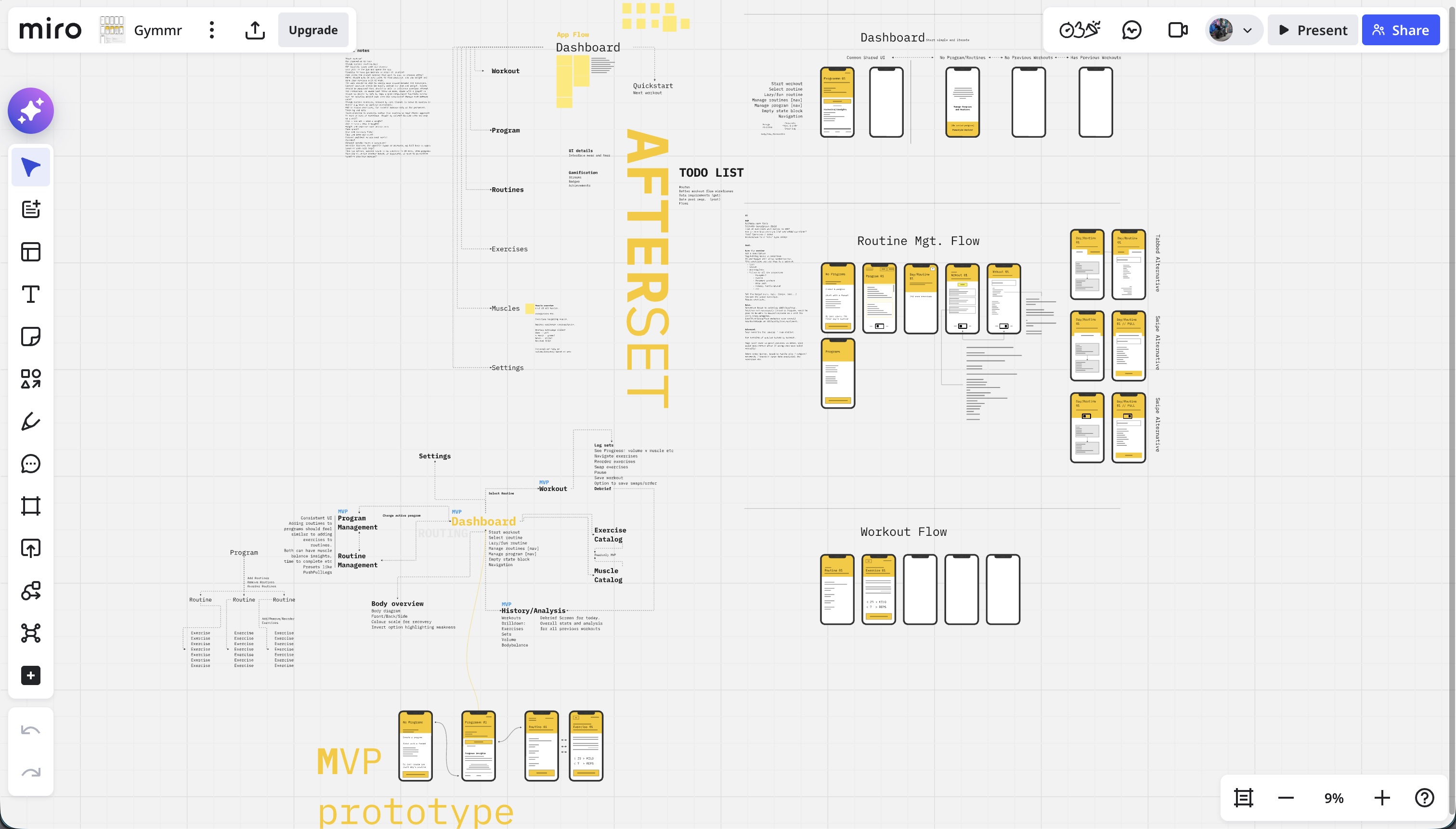
I started learning about graph data structures and graph databases through building Afterset. Without AI I'd never have had the patience or time. Using Residents as a boilerplate, Claude and I built an Arango database that we'd use as a back-end for a weight training app, where each set of an exercise could be roughly attributed to each muscle involved, so that as you build up training logs you'd be able to see what muscles are being used too much or too little. I got stuck into Miro and started wire-framing. The app/front-end of Afterset had no plan yet and I'd never tried any iOS/Swift development at this point. I started trying out React Native but ended up parking the app for the time being.
The next thing on this timeline was ClaudeCode. I was still using Claude via Continue a lot at this stage, at work and at home, still using the pay-as-you-go model via the API. ClaudeCode came out as a developer preview in late February 2025 - I'm writing all of this on its first birthday. I started using it from day one, but at the time it was also paying by the token/API, and it absolutely burned through money. It was way more expensive than using the API, but even then it felt like a completely different beast to Cursor and Continue.
I still kept Continue as my primary tool due to the cost of using ClaudeCode, but if I was stuck on something I'd reach for ClaudeCode and it would nearly always nail it. I'd definitely have been using ClaudeCode full-time back then if I'd had a room full of cash to burn.
In spring 2025 I left Nory and went back to Toast to work on a React Native product. I had a lot of React experience by then but no significant iOS or Android experience, making it a good move for learning some new tech. It aligned well with me wanting to build my own products and iOS apps. By now most big tech companies had started to push these new AI workflows too - so we had pilot programs for Cursor, followed soon after by ClaudeCode. ClaudeCode has been my main tool in my day-job for about 9 months now too and writes most of my code. I'll write a separate more technical post about how I work with it on the day to day.
By now ClaudeCode had the new subscription model, and I was using the basic €20/month subscription on my personal account, but was hitting the usage limits too quickly. Soon I bumped up to a Claude Max account at around €100/month. I think if there's ever an important time to pay this much for a subscription, it's during these formative years of AI.
I was hitting the usage limits because I had started building a new iOS app called [Grapla](https://grapla.app) and the flow state with ClaudeCode was getting highly addictive. I ended up committing code to my personal Github account on 360 days of 2025. Grapla turned into a massive rabbit-hole that I'm still building, but it's teaching me a lot.
"The Grapla repo began on April 30, 2025"
-- ClaudeCode
I won't get into the details of that app here because it'll end up doubling the length of this essay. It'll be a good subject for a series later. But it taught me a massive amount of iOS development, and triple that again in ways of building with Claude. One recurring theme in both work and side projects is the speed that you can build tooling and scripts to support the main project, and these often grow into their own side projects.
For iOS projects I ended up building [XC-MCP](https://github.com/conorluddy/xc-mcp) (an MCP that wraps XCodebuild so that Claude can build your app without having to eat 40,000 tokens in output logs), [ios-simulator-skill](https://github.com/conorluddy/ios-simulator-skill) (now with 500+ stars on Github - (but it's just a Claude-Skill port of XCMCP)), and another tool called [Persuader](https://github.com/conorluddy/Persuader) - intended to "persuade" Claude to consistently generate data to match a schema.
Back in the day job I was still sharing ways I was finding useful to work with Claude, and sharing tips and shortcuts and insights. I gave a couple of talks on MCP servers, one virtually and one in a room full of real people in our Boston office - explaining what MCPs are for and why they can be valuable and/or save tokens and money. This boils down to "context engineering" and optimising how context and tokens are used - although since promoting MCPs back then, it's now better to use Skills and not to have any MCPs or plugins active unless you're actively using them. They add unnecessary tokens to every session, costing you money even if you're not using them.
At the time though, I was all about the MCPs, and thought I'd try to build an MCP that would spawn other MCPs, like a boilerplate/manager type thing. I called it [ContextPods](https://github.com/conorluddy/ContextPods) because the pods were supposed to be little modular MCPs that would handle context for the agents. Never ended up using it for anything in the end, but all of these were practice and taught me different things.
The Grapla app was taking a long time but had also produced a lot of reusable patterns and tooling. One Saturday I had been thinking about the Afterset app that hadn't been touched since I started Grapla. The JSON data that had been generated for it was ripe for revival, and since I'd last looked at the project I'd gone and learned a bunch about iOS development. Now I knew it didn't even really need a back-end - everything could just live on the phone and work offline.
I decided to see if we could start an iOS project for Afterset on a weekend and have it submitted to the AppStore by the Sunday evening. Apple reviewed it within 24 hours, and it live and downloadable by Monday evening. It was far from perfect, but it was proof that all the work on my other app had paved the way for getting apps built fast.
The problem now was that Afterset was live as a weekend project, but I couldn't just leave it there like that, it needed a bunch of work to make it actually be any good. The POC of getting an app live in a weekend had turned into a time trap. So Grapla got parked for a while and I tried to get Afterset up to a state where it could be used in the gym without having too many missing features. It needs a lot more work, but it's another app that I can do a complete write-up on soon.
I finally parked Afterset (it still needs more work) and got back to Grapla, and while Claude was building me out a separate NextJs marketing website for it we got chatting about ideas. All of the data for the app is JSON, so it can be plucked into other projects too. With the marketing website done we started discussing how we could generate other marketing assets.
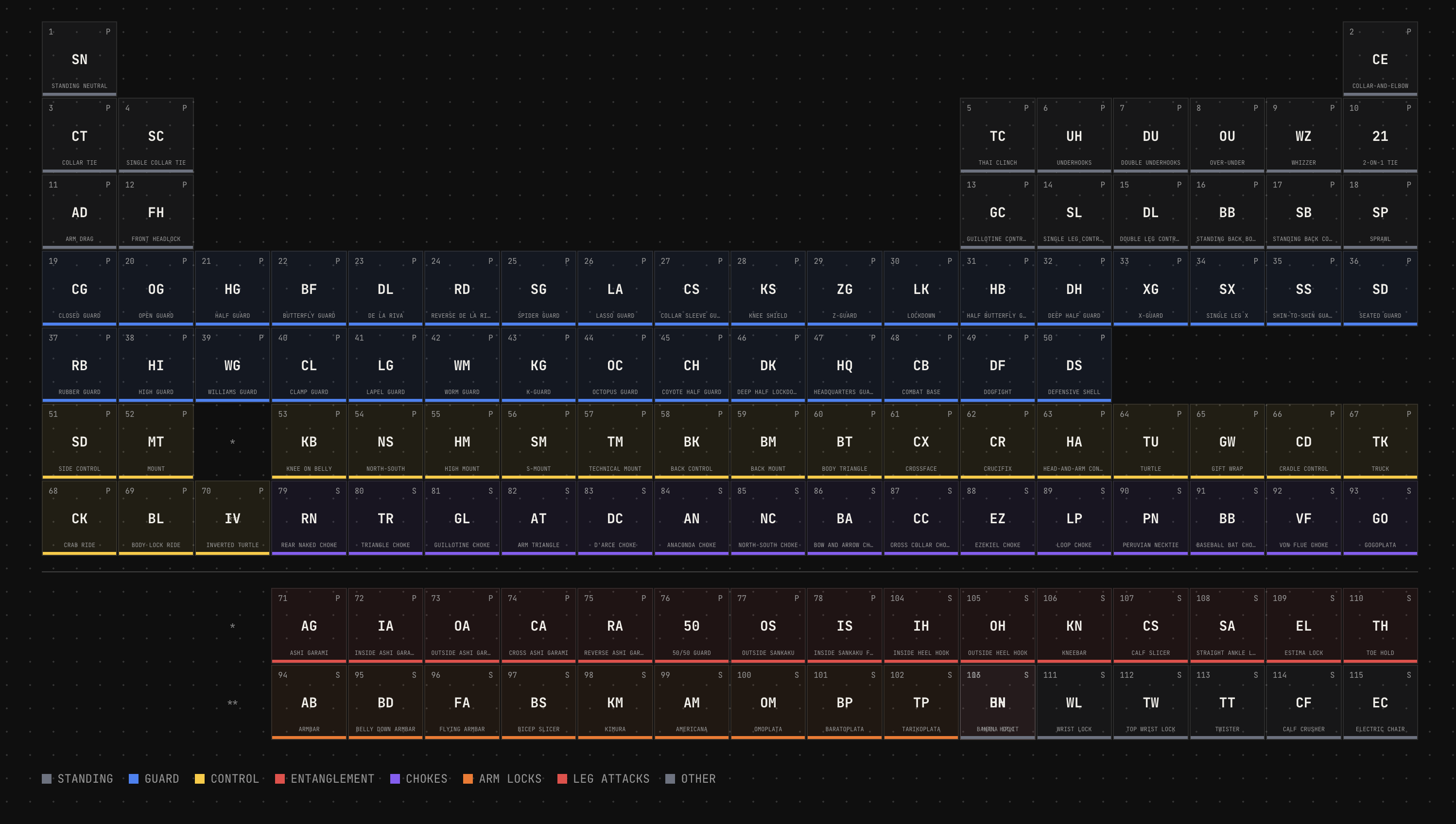
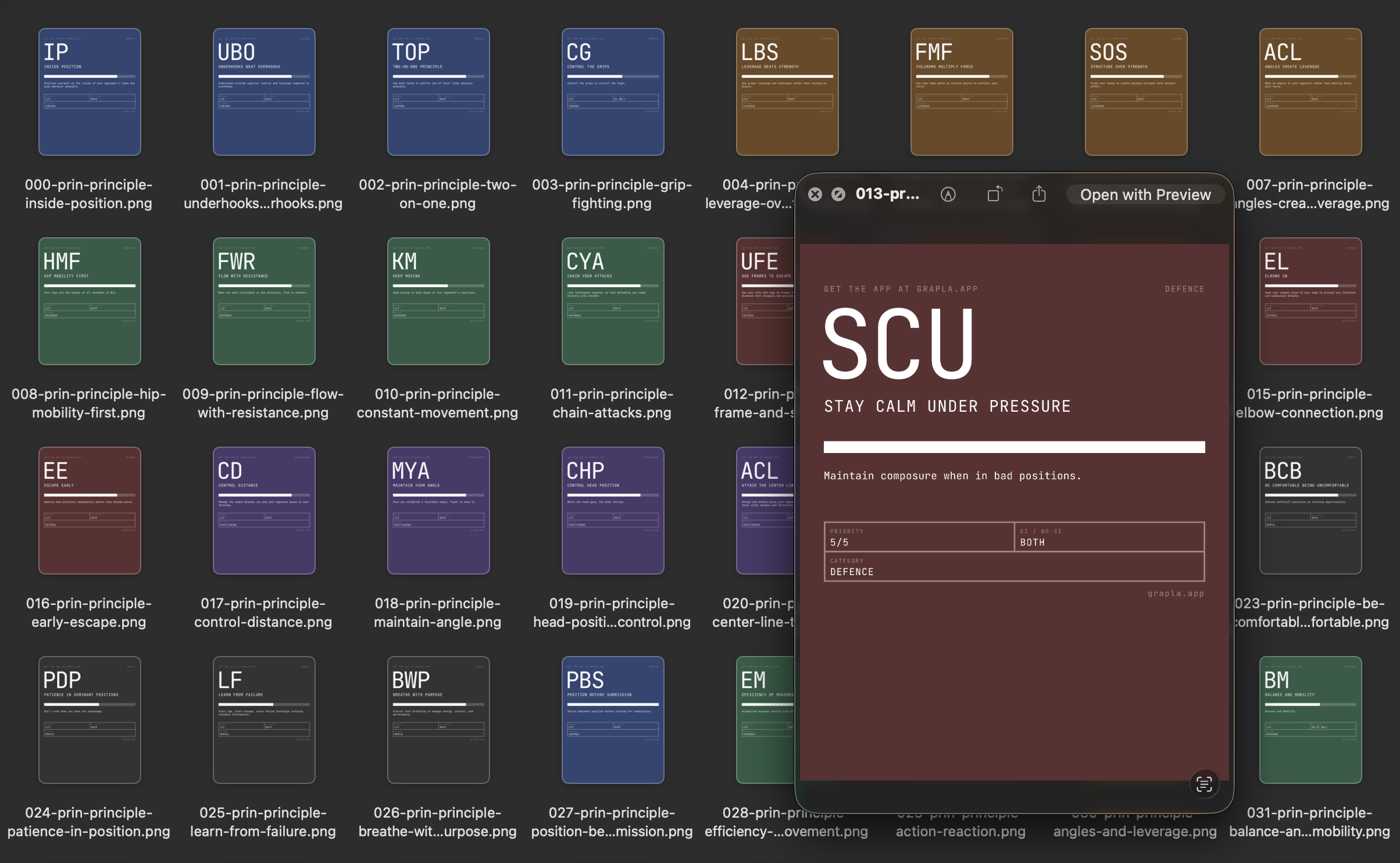
I often tell Claude to create experiments using prompts like "build us ten variations of X" and we'll cross pollinate ideas and polish up something that comes out of it. In this case it randomly came up with a periodic table of Jiu Jitsu that turned into a super feature for SEO on the website - but that also evolved into something that could render social media images for hundreds of the positions in our app data.
[](https://grapla.app)
So we had an endpoint that rendered images in social media format, and a script that would hit it for each entity in our data. Hundreds of images generated in under a minute, using nice colour palette generated by ChromaJs. Claude then went a step further and created flow videos with ffmpeg. Grapla is a Jiu Jitsu app, so these videos are all just flow sequences ending in submissions, perfect for the marketing Tiktok/Insta accounts.
If anything can be done on a command line, Claude can do it and automate it.
The latest thing I've been exploring is augmenting [Obsidian](https://obsidian.md) with Claude. I'm seeing if I can build a Zod and data graph layer over it that Claude can plug into. Then I'll be using it as a central knowledge base that contains documentation, specs and idea/discovery content for all of my projects. Claude will be able to extract a strongly typed JSON representation of it all and hopefully able to cross-pollinate ideas and resources between everything.
Before I go too deep down that rabbit hole though I need to get Grapla launched.

Somehow between starting this write-up and finishing it, I ended up building another minimal app called [FrictionList](https://apps.apple.com/us/app/frictionlist/id6759489834) that's ~~currently being reviewed by Apple~~.
These little CSS phone mockups and the timelines at the edges (only on big screen) were also built by Claude, purely for this article - they were fun.
I'll never be dogmatic about ways to work with AI - it's a very open-ended and subjective experience and everyone has their own approach. But I'll be sharing what works for me, and what feels like useful details of all of the different things I worked with it on over the past few years. More ramblings coming soon...
---
# Code Style Guide
Write for understanding, optimize for limited attention. I use some version of this guide in most of my projects, to help keep them LLM and human friendly.
category: Reference
date: 2026-02-20
reading-time: 20 min read
url: https://conor.fyi/writing/codestyle
---
> **Core Principle**: Context is finite. Every token — code, comment, structure — competes for limited attention. Maximize signal, minimize noise. Write for two audiences: humans with limited working memory and AI agents with bounded context windows.
## Philosophy
The optimal code is the minimum necessary to solve the problem correctly. Every additional line is debt.
**Progressive Disclosure**: Structure code layer-by-layer. Readers grasp high-level flow immediately, drilling into details only when needed. File names indicate purpose. Directory structures mirror conceptual hierarchies. Function names describe behavior without reading implementation.
**Self-Documenting**: Names eliminate need for comments. Comments explain "why," never "what." If you chose algorithm A over B for subtle reasons, state that. If you're working around a library bug, explain it.
**Aggressive Minimalism**: Before adding code, ask: "Is this the simplest solution?" Before adding a comment: "Does this clarify something non-obvious?" Before introducing an abstraction: "Does this reduce complexity, or merely relocate it?"
**AHA Over DRY**: Avoid Hasty Abstractions. Wait for the 3rd duplication before extracting. The wrong abstraction is worse than duplication. Three similar lines of code is better than a premature abstraction.
## Progressive Disclosure
Structure every layer of your system so readers — human or agent — get the right level of detail at the right time. No one should need to read 2000 lines to understand what a module does.
### The Zoom Principle
Code should work like a map: zoom out for the big picture, zoom in for street-level detail. Each zoom level should be self-sufficient.
```
// Level 0: Directory structure tells you what exists
src/
├── authentication/ # "There's an auth system"
├── orders/ # "There's an order system"
├── payments/ # "There's a payment system"
└── README.md # How they connect
// Level 1: Index file tells you what it can do
// authentication/index.ts
export { authenticateUser } from './authenticate';
export { refreshSession } from './sessions';
export { revokeAccess } from './revoke';
// No implementation visible — just capabilities
// Level 2: Function signature tells you the contract
async function authenticateUser(
credentials: UserCredentials,
db: Database,
clock: Clock
): Promise
>
// Level 3: Implementation tells you how
// Only read this when you need to change the behaviour
```
### File-Level Disclosure
Every file should answer "what is this?" in its first 10 lines. Implementation details belong below.
```typescript
// ✅ Top of file reveals purpose, contract, and shape
/**
* Order Processing Pipeline
*
* Validates → enriches → prices → submits orders.
* Entry point: processOrder()
* Error strategy: Result types, no throws
*/
// Types first — the contract
type ProcessOrderInput = { /* ... */ };
type ProcessOrderResult = Result;
// Public API second
export async function processOrder(input: ProcessOrderInput): Promise {
const validated = validateOrder(input);
if (!validated.ok) return validated;
const enriched = await enrichWithInventory(validated.value);
if (!enriched.ok) return enriched;
return submitOrder(enriched.value);
}
// Private helpers last — only read if you need to understand a specific step
function validateOrder(input: ProcessOrderInput): Result {
// ...
}
```
```typescript
// ❌ Implementation soup — must read everything to understand anything
import { db } from '../globals';
const RETRY_COUNT = 3;
const BACKOFF_MS = 100;
function helper1() { /* ... */ }
function helper2() { /* ... */ }
// 200 lines later...
export function processOrder() { /* ... */ }
```
### Documentation Disclosure
Match documentation depth to the reader's likely intent. Most readers want "what does this do?" — very few want "why did you choose bcrypt over argon2?"
```
Level 1 — CLAUDE.md (5 seconds)
"This is an order processing API. Entry: src/api/server.ts"
Level 2 — Module README (30 seconds)
"Orders go through validate → enrich → price → submit.
Uses Result types. Retries on transient failures."
Level 3 — Section comments (2 minutes)
// ========================================
// PRICING ENGINE
// ========================================
// Applies tiered discounts, tax rules, and currency conversion.
// See: docs/pricing-model.md for business rules.
Level 4 — Inline "why" comments (as needed)
// Using ceiling division here because partial units
// must be billed as full units per the SLA.
```
### API & Type Disclosure
Public interfaces should be scannable summaries. Implementation types stay internal.
```typescript
// ✅ Public types: minimal, focused, scannable
// orders/types.ts — what consumers need to know
export type OrderSummary = {
id: OrderId;
status: OrderStatus;
total: Money;
itemCount: number;
createdAt: DateTime;
};
// orders/internal-types.ts — implementation detail
// Not exported. Contains pricing breakdowns, audit trails,
// intermediate computation states, retry metadata, etc.
type OrderPricingContext = { /* ... */ };
type OrderAuditEntry = { /* ... */ };
```
### Disclosure Anti-Patterns
- **Premature depth**: Putting implementation details in README files
- **Flat disclosure**: 500-line files with no visual hierarchy or grouping
- **Inverted disclosure**: Helpers at top, public API buried at bottom
- **Missing levels**: Jumping from directory listing straight to inline comments with nothing in between
## Naming
The #1 impact on readability. Good names eliminate mental translation overhead.
```
// ✅ Descriptive, unambiguous
async function validateJsonAgainstSchema(
schema: ZodSchema,
input: string
): Promise
function calculateExponentialBackoff(
attemptNumber: number,
baseDelayMs: number
): number
// ❌ Vague, abbreviated
async function valJson(s: any, i: string): Promise
function calcBackoff(n: number, d: number): number
```
**Rules**:
1. **Be specific**: `activeUsers` not `users`, `httpTimeoutMs` not `timeout`
2. **Include units**: `delayMs` not `delay`, `maxRetries` not `max`
3. **Avoid abbreviations**: `customer` not `cust`, `configuration` not `cfg`
4. **Use domain language**: Names from business domain, not technical abstractions
5. **Boolean prefixes**: `isValid`, `hasPermission`, `canEdit`, `shouldRetry`
6. **Verbs for functions**: `validateEmailFormat()` not `checkEmail()`, `fetchActiveUsers()` not `getUsers()`
## Function Design
### Single Responsibility with Explicit Contracts
```
// ✅ Self-contained, explicit dependencies, typed contract
async function authenticateUser(
credentials: UserCredentials,
database: Database,
currentTime: DateTime
): Promise> {
// All dependencies visible in signature
// Return type reveals all possible outcomes
}
// ❌ Hidden dependencies, unclear contract
async function auth(data: any): Promise {
// Uses global config, modifies global state
}
```
### Guard Clauses Over Nesting
Handle edge cases first, keep the happy path unindented and visible.
```
// ✅ Guard clauses — happy path clear
function processOrder(order: Order): Result {
if (!order) return err('missing_order');
if (order.items.length === 0) return err('empty_order');
if (order.total <= 0) return err('invalid_total');
if (!order.paymentMethod) return err('missing_payment');
return ok(completePayment(order));
}
// ❌ Nested conditions — happy path buried
function processOrder(order: Order) {
if (order) {
if (order.items.length > 0) {
if (order.total > 0) {
// Happy path buried 4 levels deep
}
}
}
}
```
### Design Rules
1. **Single responsibility** — describable in one sentence
2. **Explicit dependencies** — all inputs as parameters, no hidden global state
3. **Type everything** — TypeScript strict mode, Python type hints
4. **Self-contained context units** — comprehensible without reading other files
5. **50-line guideline** — not a hard limit, but a refactoring trigger
## Error Handling
### Result Types — Make Errors Explicit
Errors belong in function signatures, not hidden behind `throw`.
```
type Result =
| { ok: true; value: T }
| { ok: false; error: E };
type UserError = 'not_found' | 'unauthorized' | 'network_failure';
async function fetchUser(id: string): Promise> {
// Errors are part of the contract
}
// Usage forces error handling — compiler catches missing cases
const result = await fetchUser(userId);
if (!result.ok) {
switch (result.error) {
case 'not_found': return show404();
case 'unauthorized': return redirectLogin();
case 'network_failure': return showRetry();
}
}
```
**When to use Result types**: API calls, file I/O, validation, any complex error path.
**When to use exceptions**: Truly exceptional/unrecoverable situations (out of memory, corrupted state).
### Branded Types — Validate at Boundaries
```
type ValidatedEmail = string & { readonly __brand: 'ValidatedEmail' };
type UserId = string & { readonly __brand: 'UserId' };
function validateEmail(input: string): ValidatedEmail | null {
return isValidEmail(input) ? (input as ValidatedEmail) : null;
}
// Type system prevents using unvalidated data
function sendEmail(to: ValidatedEmail, subject: string) {
// No need to re-validate — type guarantees validity
}
```
Once you have a `ValidatedEmail`, downstream functions carry zero validation overhead. The type system encodes the knowledge that validation occurred.
### Error Principles
1. **Never silently swallow errors** — log or propagate, never ignore
2. **Fail fast at boundaries** — validate inputs immediately, not deep in call stack
3. **Provide actionable messages** — what failed, expected vs actual, how to fix
```
// ✅ Actionable error with context
throw new ValidationError(
`Email validation failed for "user_email": ` +
`Expected "name@domain.com", received "${input}". ` +
`Use validateEmailFormat() to check before calling.`
);
// ❌ Opaque
throw new Error("Validation failed");
```
## File & Module Organization
### Structure with Clear Boundaries
```
// ========================================
// PUBLIC API
// ========================================
export class UserService {
constructor(private readonly db: Database) {}
async createUser(data: CreateUserData): Promise> {
// Public interface
}
}
// ========================================
// VALIDATION
// ========================================
function validateUserData(data: unknown): Result {
// Grouped validation logic
}
// ========================================
// PRIVATE HELPERS
// ========================================
function hashPassword(password: string): Promise {
// Internal implementation
}
```
### Organization Rules
1. **Group by feature/domain**, not file type — `authentication/`, `orders/`, `payments/`
2. **Public API first** — exported functions at top, helpers at bottom
3. **One major export per file** — `UserService.ts` exports `UserService`
4. **Co-locate tests** — `UserService.test.ts` next to `UserService.ts`
5. **300-line guideline** — not a hard limit, but a refactoring trigger
6. **Minimal cross-module dependencies** — each module is a clean context boundary
```
project/
├── authentication/ # Self-contained context
│ ├── index.ts # Public API only
│ ├── credentials.ts
│ ├── sessions.ts
│ └── README.md # Module architecture
├── orders/ # Independent context
└── storage/ # Independent context
```
## Testing
### Testing Trophy — Mostly Integration
"Write tests. Not too many. Mostly integration." — Kent C. Dodds
1. **Static Analysis** (foundation): TypeScript strict mode, ESLint
2. **Unit Tests** (narrow): Pure functions, complex algorithms
3. **Integration Tests** (widest — most tests here): How pieces work together, where bugs actually live
4. **E2E Tests** (top): Critical user journeys only
### Tests as Documentation
Test names describe scenarios. Docstrings explain "why." Tests demonstrate usage.
```
test('should reject invalid credentials without revealing if username exists', async () => {
// Prevents username enumeration attacks
const auth = new Authenticator(database);
const result = await auth.authenticate({
email: 'nonexistent@example.com',
password: 'any-password'
});
expect(result.ok).toBe(false);
expect(result.error.code).toBe('INVALID_CREDENTIALS');
expect(result.error.message).not.toContain('user not found');
});
```
### Testing Rules
1. **Test behavior, not implementation** — focus on inputs/outputs, not internal state
2. **One concept per test** — don't test multiple unrelated things
3. **Integration over unit** — test pieces working together (more confidence per test, more resilient to refactoring)
4. **Clear test names** — describe the scenario: `test('user can add items to cart')`
5. **80% coverage minimum** — focus on critical paths
## Observability
### Structured Logging
```
// ✅ Structured — queryable, correlated
logger.info('Request processed', {
request_id: requestId,
user_id: userId,
endpoint: req.path,
method: req.method,
duration_ms: duration,
status_code: res.statusCode,
cache_hit: cacheHit
});
// ❌ Unstructured — hard to query
logger.info(`User ${userId} accessed ${req.path}`);
```
### What to Log
**Always include**: request\_id, user\_id, trace\_id, entity IDs, operation type, duration\_ms, error details.
**Log at critical boundaries**:
* External API calls (request/response)
* Database operations (query, duration)
* Authentication/authorization decisions
* Error occurrences with full context
**One structured event per operation** — derive metrics, logs, or traces from the same data. Don't instrument separately for each observability pillar.
## Agentic Coding Patterns
These patterns address the unique demands of code that will be read, modified, and executed by AI agents alongside humans.
### Idempotent Operations
Agents retry. Network calls fail. Tasks get re-run. Design every mutation to be safely repeatable.
```
// ✅ Idempotent — safe to retry
async function ensureUserExists(
email: ValidatedEmail,
db: Database
): Promise {
const existing = await db.users.findByEmail(email);
if (existing) return existing;
return db.users.create({ email });
}
// ❌ Non-idempotent — duplicates on retry
async function createUser(email: string, db: Database): Promise {
return db.users.create({ email });
}
```
### Explicit State Machines Over Implicit Flows
When operations have distinct phases, model them explicitly. Agents reason about state machines far better than implicit status flags scattered across objects.
```
type OrderState =
| { status: 'draft'; items: Item[] }
| { status: 'submitted'; items: Item[]; submittedAt: DateTime }
| { status: 'paid'; items: Item[]; submittedAt: DateTime; paymentId: string }
| { status: 'shipped'; items: Item[]; trackingNumber: string };
// Each transition is a pure function with clear preconditions
function submitOrder(order: OrderState & { status: 'draft' }): OrderState & { status: 'submitted' } {
return { ...order, status: 'submitted', submittedAt: DateTime.now() };
}
```
### Machine-Parseable Errors
Agents need structured errors alongside human-readable ones. Return error codes that can be programmatically matched, with messages that explain context.
```
type AppError = {
code: 'VALIDATION_FAILED' | 'NOT_FOUND' | 'CONFLICT' | 'UPSTREAM_TIMEOUT';
message: string; // Human-readable explanation
field?: string; // Which input caused it
retryable: boolean; // Can the caller retry?
};
```
### Atomic, Independently-Verifiable Changes
Structure work so each change can be validated in isolation. This applies to commits, PRs, and function design. An agent (or reviewer) should be able to verify correctness without understanding the entire system.
```
// ✅ Each function is independently testable and verifiable
function parseConfig(raw: string): Result { /* ... */ }
function validateConfig(config: Config): Result { /* ... */ }
function applyConfig(config: ValidConfig, system: System): Result { /* ... */ }
// ❌ Monolithic — must understand everything to verify anything
function loadAndApplyConfig(path: string): void { /* 200 lines */ }
```
### Convention Over Configuration
Reduce the search space for agents (and humans). Consistent patterns mean less context needed per decision.
* Consistent file naming: `UserService.ts`, `UserService.test.ts`, `UserService.types.ts`
* Predictable directory structure across features
* Standard patterns for CRUD operations, API endpoints, error handling
* If your project has a pattern, follow it. If it doesn't, establish one and document it
### Contract-First Design
Define types before implementation. Types are the cheapest, most scannable form of documentation. An agent reading your types understands your system's data flow without reading a single function body.
```
// Define the contract first
interface OrderService {
create(data: CreateOrderInput): Promise>;
cancel(id: OrderId, reason: CancelReason): Promise>;
findByUser(userId: UserId, pagination: Pagination): Promise>;
}
// Then implement — the types guide everything
```
### Observable Side Effects
Every mutation should produce structured output describing what changed. This enables agents to verify their actions and enables humans to audit.
```
type MutationResult = {
data: T;
changes: Change[]; // What was modified
warnings: string[]; // Non-fatal issues encountered
};
async function updateUserProfile(
id: UserId,
updates: ProfileUpdates
): Promise, UpdateError>> {
// Returns both the result AND a description of what changed
}
```
### Context Optimisation & Token Economics
> Every token an agent reads is a token it can't use for reasoning. Treat context like memory in an embedded system — budget it, measure it, and refuse to waste it.
#### The Context Budget
AI agents operate within fixed context windows. Your code, documentation, error messages, and tool outputs all compete for the same finite space. Code that is token-efficient isn't just neat — it directly improves agent reasoning quality.
```
Context Window (finite)
├── System prompt & instructions ~2-5k tokens (fixed cost)
├── Conversation history ~variable
├── Tool definitions ~1-10k tokens (per tool schema)
├── Retrieved code / docs ~variable ← YOU CONTROL THIS
├── Agent reasoning ~variable ← THIS GETS SQUEEZED
└── Output generation ~variable ← AND SO DOES THIS
The more tokens your code consumes, the less room the agent
has to think. Optimise ruthlessly.
```
#### Semantic Compression
Collapse granular interfaces into high-level semantic operations. Instead of exposing every low-level action, expose intent-based APIs.
```typescript
// ❌ 15 granular tools = ~15k tokens of schema
// An agent must read and reason about ALL of them
tools: [
createFile, readFile, deleteFile, moveFile, copyFile,
listDirectory, createDirectory, deleteDirectory,
getFileMetadata, setFilePermissions, watchFile,
compressFile, decompressFile, hashFile, diffFiles
]
// ✅ 1 semantic dispatcher = ~1k tokens of schema
// Agent reasons about intent, not mechanics
tools: [{
name: "filesystem",
description: "Manage files and directories",
parameters: {
operation: "create | read | delete | move | copy | list | ...",
path: "string",
options: "object (operation-specific)"
}
}]
```
This is the dispatcher pattern: consolidate related tools behind a single entry point that routes by intent. Token cost drops dramatically while functionality stays the same.
#### Layered Context Loading
Don't front-load everything. Provide summaries first, with drill-down paths for when the agent actually needs more detail.
```typescript
// ✅ Layered: summary first, details on demand
function getProjectOverview(): ProjectSummary {
return {
name: "DataPipeline",
modules: ["ingestion", "transform", "export"],
entryPoint: "src/main.ts",
recentChanges: getRecentChangeSummary(5),
// Drill-down references — agent only loads what it needs
getModuleDetail: (name: string) => loadModuleContext(name),
getFileContent: (path: string) => loadFileContext(path),
};
}
// ❌ Eager: dumps everything into context upfront
function getProjectContext(): FullProjectDump {
return {
allFiles: readAllFiles(), // 50k tokens
allTests: readAllTests(), // 30k tokens
allDocs: readAllDocs(), // 20k tokens
// Agent's context window is now full before it starts thinking
};
}
```
#### Token-Aware Documentation
Write documentation that serves both human readers and token budgets. Every word should earn its place.
```markdown
# ❌ Token-heavy: narrative style, repetitive, verbose
## Overview of the Authentication Module
The authentication module is responsible for handling all aspects of user
authentication within our application. This module was designed with security
best practices in mind and implements industry-standard protocols. The module
handles user login, token generation, session management, and token refresh
functionality. It is important to note that this module uses JWT tokens for
authentication purposes.
(~80 tokens to say what could be said in 15)
# ✅ Token-efficient: dense, scannable, no filler
## Authentication
JWT-based auth with refresh token rotation.
- Entry: `authenticate()` → `Result`
- Tokens: 15min access, 7d refresh (HTTP-only cookie)
- Storage: PostgreSQL users, Redis token blacklist
(~40 tokens, more information conveyed)
```
#### Structured Output for Agent Consumption
When building tools or functions that agents will consume, prefer structured, parseable output over human-readable prose.
```typescript
// ✅ Agent-friendly: structured, parseable, minimal
type BuildResult = {
success: boolean;
errors: { file: string; line: number; code: string; message: string }[];
warnings: { file: string; line: number; code: string; message: string }[];
stats: { duration_ms: number; filesProcessed: number };
};
// ❌ Human-only: requires parsing natural language
function getBuildOutput(): string {
return `Build completed with 2 errors and 1 warning.
Error in src/auth.ts line 42: Type 'string' is not assignable...
Error in src/orders.ts line 18: Property 'id' does not exist...
Warning in src/utils.ts line 7: Unused variable 'temp'...
Build took 3.2 seconds, processed 47 files.`;
}
```
#### Context Boundaries as Architecture
Design modules so an agent can work within one module without loading others. Each module should be a self-contained context unit.
```typescript
// ✅ Clean context boundary — agent only needs this module
// payments/index.ts
export interface PaymentService {
charge(input: ChargeInput): Promise>;
refund(id: PaymentId, reason: RefundReason): Promise>;
}
// payments/types.ts — all types co-located, no external dependencies
export type ChargeInput = {
amount: Money;
method: PaymentMethod;
idempotencyKey: string; // Agent-friendly: built-in retry safety
};
// payments/errors.ts — exhaustive, machine-readable
export type PaymentError =
| { code: 'INSUFFICIENT_FUNDS'; available: Money }
| { code: 'CARD_DECLINED'; reason: string; retryable: false }
| { code: 'GATEWAY_TIMEOUT'; retryable: true };
```
```
// ❌ Leaky context boundary — agent must load 4 modules to understand 1
// payments/index.ts
import { User } from '../users/types';
import { Order } from '../orders/types';
import { AuditLogger } from '../audit/logger';
import { ConfigManager } from '../config/manager';
// Agent now needs context from users/, orders/, audit/, config/
```
#### Compression Strategies Reference
| Strategy | Before | After | Savings |
|----------|--------|-------|---------|
| Semantic dispatchers | N tool schemas (~N × 1k tokens) | 1 dispatcher (~1k tokens) | ~(N-1)k tokens |
| Layered loading | Full dump (50k tokens) | Summary + drill-down (2k + on-demand) | ~48k idle tokens |
| Dense docs | Narrative prose (~80 tokens/concept) | Structured bullets (~40 tokens/concept) | ~50% |
| Co-located types | Scattered across modules | Single `types.ts` per module | Fewer file loads |
| Summary-first returns | Full object graphs | Summary + reference IDs | 60-90% per call |
| Discriminated unions | Generic error + message string | Typed union with `code` field | Eliminates parsing |
## Project Navigation
### CLAUDE.md at Project Root
Every project needs a navigation file. List entry points, patterns, and common tasks.
```
# Project: Data Processing Pipeline
## Entry Points
- `src/main.ts`: CLI interface
- `src/api/server.ts`: REST API
- `src/processors/pipeline.ts`: Core processing
## Key Patterns
- All processors implement `Processor` interface (src/processors/base.ts)
- Config uses Zod schemas (src/config/schemas.ts)
- External APIs via `APIClient` (src/external/client.ts)
## Common Tasks
- Add data source → implement `DataSource` in `src/api/sources/`
- Add transformation → implement `Transformer` in `src/processors/transformers/`
```
Keep under 200 lines. Update when architecture changes.
### Module-Level READMEs
Every major directory gets a README answering: What is this? How does it work? What are the gotchas?
```
# Module: User Authentication
## Purpose
JWT-based authentication with refresh token rotation
## Key Decisions
- bcrypt cost factor 12 for password hashing
- Access tokens expire after 15 minutes
- Refresh tokens stored in HTTP-only cookies
## Dependencies
- jose library for JWT (not jsonwebtoken — more secure)
- PostgreSQL for user storage
- Redis for token blacklist
```
### Progressive Context Hierarchy
1. **CLAUDE.md / README.md at root** — system overview, entry points, setup
2. **README.md per major module** — module purpose, key decisions, patterns
3. **Section comments in files** — group related code with clear headers
4. **Function/class docs** — purpose, examples for non-obvious APIs
5. **Inline comments** — only for "why" decisions
## Anti-Patterns
* **Premature optimization** — Measure first, optimize second
* **Hasty abstractions** — Wait for 3rd duplication before extracting
* **Clever code** — Simple and obvious beats clever and compact
* **Silent failures** — Log and propagate, never swallow
* **Vague interfaces** — `process(data: any): any` provides zero guidance
* **Hidden dependencies** — Global state, singletons, ambient imports
* **Nested conditionals** — Use guard clauses instead
* **Comments describing "what"** — If you need a comment to explain what code does, rename things
* **Premature generalization** — Build for today's requirements, not hypothetical futures
* **Token bloat** — Functions returning everything when callers need summaries
* **Inverted disclosure** — Helpers at top, public API buried at bottom
* **Flat files** — 500-line files with no visual hierarchy, grouping, or section comments
* **Leaky context boundaries** — Modules that import heavily from siblings, forcing agents to load the entire codebase
* **Eager context loading** — Dumping full project state into agent context when a summary would suffice
## Checklist
Before submitting code:
* Solves the stated problem with minimal code?
* A new developer can understand it without extensive context?
* Errors handled with actionable messages?
* Names clear, specific, and unambiguous?
* Functions have single, clear responsibilities?
* Dependencies explicit (no hidden global state)?
* Tests cover critical paths?
* Operations idempotent where applicable?
* Types define contracts before implementation?
* Would this work well with ~200 lines of surrounding context?
* Can an agent understand this module without loading adjacent modules?
* Are public APIs scannable in under 50 lines?
* Do tool/function outputs use structured types, not prose?
* Is documentation token-dense (no filler words, no repetition)?
* Does the file follow progressive disclosure (types → public API → helpers)?
---
*"Any fool can write code that a computer can understand. Good programmers write code that humans can understand." — Martin Fowler*
---
# Building a Design System on Mathematical Harmony
The algebra of beautiful design
category: Frontend
date: 2026-01-16
reading-time: 8 min read
url: https://conor.fyi/writing/golden-ratio-grid
---
Most design systems feel arbitrary—a collection of numbers chosen because they seemed reasonable. This one is different. Every spacing value, every font size, every breakpoint follows mathematical sequences that naturally create visual harmony.
## The Philosophy
Design systems should be predictable. When you know that spacing follows the Fibonacci sequence and font sizes follow the same pattern, you don't need to guess. You don't need a design spec with 47 different margin values. You need one simple rule: multiply by φ (the golden ratio, ≈1.618).
The system is built on two foundational ideas:
1. **The Golden Ratio** - A mathematical constant that appears throughout nature and has been used in art and architecture for centuries
2. **The Fibonacci Sequence** - A series where each number is the sum of the two before it (0, 1, 1, 2, 3, 5, 8, 13, 21, 34, 55, 89...)
These aren't decorative. They're the entire foundation.
## The Golden Ratio Grid
The layout starts with a single column: **34em** wide. For a reading experience optimized around 65–75 characters per line (the sweet spot for comprehension), this is perfect.
But a single column is boring. On larger screens, we need a secondary column. We get it by dividing by φ:
```text
34em ÷ 1.618 ≈ 21em
```
The gutter between them is φ itself:
```text
1.618em ≈ 26px at a 16px base font size
```
Total width:
```text
34em + 1.618em + 21em = 56.618em
```
On mobile, the two-column layout collapses to a single column. The grid reactivates at 900px.
### In CSS:
```css
:root {
--phi: 1.618;
--grid-primary: 34em;
--grid-secondary: 21em;
--grid-gutter: calc(var(--phi) * 1em); /* 1.618em */
--grid-total: 56.618em;
}
.grid-golden {
display: grid;
grid-template-columns: 1fr;
gap: var(--space-8);
}
@media (min-width: 900px) {
.grid-golden {
grid-template-columns: var(--grid-primary) var(--grid-secondary);
gap: var(--grid-gutter);
}
}
```
## Typography: Three Fonts, One Purpose
The typography system uses **three fonts**, each with a distinct role:
### 1. **Monda** (Body text)
- Weights: 400, 500, 600, 700
- Role: Primary reading font for paragraphs, UI labels, lists
- Why: Geometric and readable; weights provide hierarchy without changing fonts
### 2. **Kanit 100** (Display)
- Weight: 100 (ultra-thin)
- Role: h1 only—the page title
- Why: Dramatic contrast. Ultra-thin at large size creates visual impact without noise
### 3. **Space Mono** (Structure + Code)
- Weights: 400, 700
- Role: Headings (h2–h6), code blocks, labels
- Why: Monospace creates a structured, technical feel. Separates hierarchy visually
### In CSS:
```css
h1 {
font-family: var(--font-display); /* Kanit 100 */
font-size: var(--font-size-2xl);
font-weight: 100;
}
h2, h3, h4, h5, h6 {
font-family: var(--font-secondary); /* Space Mono */
font-weight: 700;
}
body {
font-family: var(--font-base); /* Monda */
}
code, pre {
font-family: var(--font-secondary); /* Space Mono */
}
```
## Fibonacci Font Sizes
Font sizes don't increment by fixed amounts (no +2px, +4px, +6px). Instead, they follow the Fibonacci sequence:
```text
8, 13, 21, 34, 55, 89 (px equivalents at 16px base)
```
Mapped to variables:
```css
--font-size-xs: 0.5em /* 8px */
--font-size-sm: 0.8125em /* 13px */
--font-size-base: 1em /* 16px */
--font-size-lg: 1.3125em /* 21px */
--font-size-xl: 2.125em /* 34px */
--font-size-2xl: 3.4375em /* 55px */
--font-size-3xl: 5.5625em /* 89px */
```
Why Fibonacci? The ratio between consecutive Fibonacci numbers approaches φ. This creates a consistent visual growth where jumping from one size to the next feels natural, not jarring.
### In CSS:
```css
p {
font-size: var(--font-size-base);
}
h3 {
font-size: var(--font-size-lg);
}
h2 {
font-size: var(--font-size-xl);
}
small {
font-size: var(--font-size-sm);
}
```
## Fibonacci Spacing
Spacing is everything in design. Too tight and text feels suffocating. Too loose and it feels disconnected. The solution: **consistent, mathematically justified spacing**.
The base unit is `0.25em` (4px at 16px root). Multiples of the Fibonacci sequence:
```css
--space-0: 0
--space-1: 0.25em /* 4px */
--space-2: 0.5em /* 8px */
--space-3: 0.75em /* 12px */
--space-5: 1.25em /* 20px */
--space-8: 2em /* 32px */
--space-13: 3.25em /* 52px */
--space-21: 5.25em /* 84px */
--space-34: 8.5em /* 136px */
--space-55: 13.75em /* 220px */
```
Every spacing decision uses these values. No custom margins. No "15px because it looked right." This means the spacing rhythm propagates throughout the entire interface.
### In CSS:
```css
h2 {
margin-top: var(--space-21); /* 84px */
margin-bottom: var(--space-5); /* 20px */
}
p {
margin-bottom: var(--space-5); /* 20px */
}
button {
padding: var(--space-3) var(--space-5); /* 12px 20px */
}
```
## Mobile-First Breakpoints
Most design systems define breakpoints based on desktop first, then squeeze mobile. This system inverts that: **mobile is the default, desktop is the enhancement**.
Six breakpoints, heavily skewed toward mobile:
```css
--breakpoint-xs: 320px /* Tiny phones */
--breakpoint-sm: 375px /* Small phones (iPhone SE) */
--breakpoint-md: 428px /* Standard phones (iPhone 14/15) */
--breakpoint-lg: 520px /* Large phones (Pro Max) */
--breakpoint-xl: 680px /* Small tablets */
--breakpoint-2xl: 900px /* Desktop → 2-column grid */
```
Why 6 breakpoints? Because mobile needs granularity. A 320px phone screen and a 680px tablet screen require different typography and spacing adjustments. But there's only one desktop breakpoint because once you reach 900px, the full two-column layout takes over.
### In CSS:
```css
.container {
padding-inline: var(--gutter-xs); /* 12px on tiny screens */
}
@media (min-width: 375px) {
.container {
padding-inline: var(--gutter-sm); /* 16px on small phones */
}
}
@media (min-width: 900px) {
.container {
padding-inline: 0; /* Grid handles spacing */
}
}
```
## Desktop Offset: Quirky Centering
On desktop, instead of centering the layout dead center, we offset it slightly to the right using—you guessed it—a Fibonacci value:
```text
var(--space-13) = 52px offset
```
This creates visual breathing room on the left while keeping the layout slightly off-center. It feels intentional and quirky rather than perfectly balanced. The offset is applied using `transform: translateX()` on the desktop breakpoint, which means it doesn't affect the layout's centering calculations—the container still measures and aligns as centered, but appears shifted.
### In CSS:
```css
@media (min-width: 900px) {
.container {
padding-inline: 0;
transform: translateX(var(--space-13)); /* 52px right */
}
}
```
Why `transform` instead of `margin`? Transform is applied after layout is calculated, so it doesn't break centering logic. Pure elegance.
## Responsive Gutters
Side padding isn't fixed—it scales with the breakpoints:
```css
--gutter-xs: 0.75em /* 12px */
--gutter-sm: 1em /* 16px */
--gutter-md: 1.25em /* 20px */
--gutter-lg: 1.5em /* 24px */
```
On desktop, the gutter vanishes because the grid's gap handles spacing. This keeps the system predictable: you're not fighting the container for space.
## Colors & Dark Mode
The color system is built on HSL. Instead of having 50 arbitrary hex colors, we define:
1. **Hue** - The color (0-360°)
2. **Saturation** - How colorful (0-100%)
3. **Lightness** - How bright (0-100%)
This makes dark mode trivial. A light mode uses lightness 90%. Dark mode uses lightness 10%. No manual color tweaks.
```css
:root {
--hue-brand: 200; /* Sky blue */
--sat-brand: 100%;
}
:root {
--color-brand-50: hsl(var(--hue-brand), var(--sat-brand), 97%);
--color-brand-500: hsl(var(--hue-brand), var(--sat-brand), 50%);
--color-brand-900: hsl(var(--hue-brand), var(--sat-brand), 19%);
}
@media (prefers-color-scheme: dark) {
:root {
--color-text-primary: var(--color-gray-50);
--color-bg-primary: var(--color-gray-900);
}
}
```
Semantic tokens map to actual use:
```css
:root {
--color-text-primary: var(--color-gray-900);
--color-bg-primary: var(--color-white);
--color-border-primary: var(--color-gray-200);
}
```
Now you use `var(--color-text-primary)` instead of `#1a1a1a`, and dark mode works automatically.
## Other Primitives
The system extends beyond spacing and typography:
- **Border radius**: `0.125em` (2px) to `1em` (16px)—all em-based so they scale
- **Shadows**: Layered for depth without heaviness
- **Transitions**: `150ms`, `200ms`, `300ms`, `500ms`—all Fibonacci-adjacent
- **Z-index**: Named layers (`--z-dropdown: 1000`, `--z-modal: 1200`)
- **Line heights**: `1.25` (tight) through `2` (loose)
## Putting It Together
These primitives don't exist in isolation. A button uses typography (font-size), spacing (padding), colors (background), transitions (hover state), and sizing. The magic is that every element cascades from the same foundation.
A simple component:
```css
button {
font-size: var(--font-size-sm);
padding: var(--space-3) var(--space-5);
background-color: var(--color-bg-brand);
color: var(--color-text-inverse);
border-radius: var(--radius-base);
transition: background-color var(--duration-fast) var(--ease-out);
}
button:hover {
background-color: var(--color-bg-brand-hover);
}
```
Every value traces back to a mathematical sequence or semantic choice. There's no guesswork.
## The Result
A design system built on mathematical principles isn't just aesthetic—it's practical:
- **Predictability**: You know how spacing works. You know how sizes scale.
- **Maintainability**: Change one variable (`--phi`) and the entire system follows.
- **Scalability**: Add a new feature, use the existing tokens, and it automatically feels cohesive.
- **Dark mode**: Automatic, no manual tweaking.
- **Accessibility**: Proper line heights, contrast ratios, and motion preferences built in.
The site you're reading now is built entirely on this system. Every margin, every font size, every color has a mathematical justification. That's not decoration—that's discipline. And discipline is what makes design systems work.
---
# iOS 26 Liquid Glass: Comprehensive Swift/SwiftUI Reference
A complete guide to Apple's most significant design evolution since iOS 7
category: Reference
date: 2025-11-16
reading-time: 17 min read
url: https://conor.fyi/writing/liquid-glass-reference
---
## Overview
iOS 26 Liquid Glass represents Apple's most significant design evolution since iOS 7, introduced at WWDC 2025 (June 9, 2025). **Liquid Glass is a translucent, dynamic material that reflects and refracts surrounding content while transforming to bring focus to user tasks**. This unified design language spans iOS 26, iPadOS 26, macOS Tahoe 26, watchOS 26, tvOS 26, and visionOS 26.
Liquid Glass features real-time light bending (lensing), specular highlights responding to device motion, adaptive shadows, and interactive behaviors. The material continuously adapts to background content, light conditions, and user interactions, creating depth and hierarchy between foreground controls and background content.
**Key Characteristics:**
- **Lensing**: Bends and concentrates light in real-time (vs. traditional blur that scatters light)
- **Materialization**: Elements appear by gradually modulating light bending
- **Fluidity**: Gel-like flexibility with instant touch responsiveness
- **Morphing**: Dynamic transformation between control states
- **Adaptivity**: Multi-layer composition adjusting to content, color scheme, and size
---
## Part 1: Foundation & Basics
### 1.1 Core Concepts
**Design Philosophy**
Liquid Glass is exclusively for the **navigation layer** that floats above app content. Never apply to content itself (lists, tables, media). This maintains clear visual hierarchy: content remains primary while controls provide functional overlay.
**Material Variants**
| Variant | Use Case | Transparency | Adaptivity |
|---------|----------|--------------|------------|
| `.regular` | Default for most UI | Medium | Full - adapts to any content |
| `.clear` | Media-rich backgrounds | High | Limited - requires dimming layer |
| `.identity` | Conditional disable | None | N/A - no effect applied |
**When to Use Each Variant:**
- **Regular**: Toolbars, buttons, navigation bars, tab bars, standard controls
- **Clear**: Small floating controls over photos/maps with bold foreground content
- **Identity**: Conditional toggling (e.g., `glassEffect(isEnabled ? .regular : .identity)`)
**Design Requirements for Clear Variant** (all must be met):
1. Element sits over media-rich content
2. Content won't be negatively affected by dimming layer
3. Content above glass is bold and bright
### 1.2 Basic Implementation
**Simple Glass Effect**
```swift
import SwiftUI
struct BasicGlassView: View {
var body: some View {
Text("Hello, Liquid Glass!")
.padding()
.glassEffect() // Default: .regular variant, .capsule shape
}
}
```
**With Explicit Parameters**
```swift
Text("Custom Glass")
.padding()
.glassEffect(.regular, in: .capsule, isEnabled: true)
```
**API Signature**
```swift
func glassEffect(
_ glass: Glass = .regular,
in shape: S = DefaultGlassEffectShape,
isEnabled: Bool = true
) -> some View
```
### 1.3 Glass Type Modifiers
**Core Structure**
```swift
struct Glass {
static var regular: Glass
static var clear: Glass
static var identity: Glass
func tint(_ color: Color) -> Glass
func interactive() -> Glass
}
```
**Tinting**
```swift
// Basic tint
Text("Tinted")
.padding()
.glassEffect(.regular.tint(.blue))
// With opacity
Text("Subtle Tint")
.padding()
.glassEffect(.regular.tint(.purple.opacity(0.6)))
```
**Purpose**: Convey semantic meaning (primary action, state), NOT decoration. Use selectively for call-to-action only.
**Interactive Modifier** (iOS only)
```swift
Button("Tap Me") {
// action
}
.glassEffect(.regular.interactive())
```
**Behaviors Enabled:**
- Scaling on press
- Bouncing animation
- Shimmering effect
- Touch-point illumination that radiates to nearby glass
- Response to tap and drag gestures
**Method Chaining**
```swift
.glassEffect(.regular.tint(.orange).interactive())
.glassEffect(.clear.interactive().tint(.blue)) // Order doesn't matter
```
### 1.4 Custom Shapes
**Available Shapes**
```swift
// Capsule (default)
.glassEffect(.regular, in: .capsule)
// Circle
.glassEffect(.regular, in: .circle)
// Rounded Rectangle
.glassEffect(.regular, in: RoundedRectangle(cornerRadius: 16))
// Container-concentric (aligns with container corners)
.glassEffect(.regular, in: .rect(cornerRadius: .containerConcentric))
// Ellipse
.glassEffect(.regular, in: .ellipse)
// Custom shape conforming to Shape protocol
struct CustomShape: Shape {
func path(in rect: CGRect) -> Path {
// Custom path logic
}
}
.glassEffect(.regular, in: CustomShape())
```
**Corner Concentricity**
Maintains perfect alignment between elements and containers across devices:
```swift
// Automatically matches container/window corners
RoundedRectangle(cornerRadius: .containerConcentric, style: .continuous)
```
### 1.5 Text & Icons with Glass
**Text Rendering**
```swift
Text("Glass Text")
.font(.title)
.bold()
.foregroundStyle(.white) // High contrast for legibility
.padding()
.glassEffect()
```
Text on glass automatically receives vibrant treatment - adjusts color, brightness, saturation based on background.
**Icon Rendering**
```swift
Image(systemName: "heart.fill")
.font(.largeTitle)
.foregroundStyle(.white)
.frame(width: 60, height: 60)
.glassEffect(.regular.interactive())
```
**Labels**
```swift
Label("Settings", systemImage: "gear")
.labelStyle(.iconOnly)
.padding()
.glassEffect()
```
### 1.6 Accessibility Support
**Automatic Adaptation** - No code changes required:
- **Reduced Transparency**: Increases frosting for clarity
- **Increased Contrast**: Stark colors and borders
- **Reduced Motion**: Tones down animations and elastic effects
- **iOS 26.1+ Tinted Mode**: User-controlled opacity increase (Settings → Display & Brightness → Liquid Glass)
**Environment Values**
```swift
@Environment(\.accessibilityReduceTransparency) var reduceTransparency
@Environment(\.accessibilityReduceMotion) var reduceMotion
var body: some View {
Text("Accessible")
.padding()
.glassEffect(reduceTransparency ? .identity : .regular)
}
```
**Best Practice**: Let system handle accessibility automatically. Don't override unless absolutely necessary.
---
## Part 2: Intermediate Techniques
### 2.1 GlassEffectContainer
**Purpose**
- Combines multiple Liquid Glass shapes into unified composition
- Improves rendering performance by sharing sampling region
- Enables morphing transitions between glass elements
- **Critical Rule**: Glass cannot sample other glass; container provides shared sampling region
**Basic Usage**
```swift
GlassEffectContainer {
HStack(spacing: 20) {
Image(systemName: "pencil")
.frame(width: 44, height: 44)
.glassEffect(.regular.interactive())
Image(systemName: "eraser")
.frame(width: 44, height: 44)
.glassEffect(.regular.interactive())
}
}
```
**With Spacing Control**
```swift
GlassEffectContainer(spacing: 40.0) {
// Glass elements within 40 points will morph together
ForEach(icons) { icon in
IconView(icon)
.glassEffect()
}
}
```
**Spacing Parameter**: Controls morphing threshold - elements within this distance visually blend and morph together during transitions.
**API Signature**
```swift
struct GlassEffectContainer: View {
init(spacing: CGFloat? = nil, @ViewBuilder content: () -> Content)
init(@ViewBuilder content: () -> Content)
}
```
### 2.2 Morphing Transitions with glassEffectID
**Requirements for Morphing:**
1. Elements in same `GlassEffectContainer`
2. Each view has `glassEffectID` with shared namespace
3. Views conditionally shown/hidden trigger morphing
4. Animation applied to state changes
**Basic Morphing Setup**
```swift
struct MorphingExample: View {
@State private var isExpanded = false
@Namespace private var namespace
var body: some View {
GlassEffectContainer(spacing: 30) {
Button(isExpanded ? "Collapse" : "Expand") {
withAnimation(.bouncy) {
isExpanded.toggle()
}
}
.glassEffect()
.glassEffectID("toggle", in: namespace)
if isExpanded {
Button("Action 1") { }
.glassEffect()
.glassEffectID("action1", in: namespace)
Button("Action 2") { }
.glassEffect()
.glassEffectID("action2", in: namespace)
}
}
}
}
```
**API Signature**
```swift
func glassEffectID(
_ id: ID,
in namespace: Namespace.ID
) -> some View
```
**Advanced Morphing Pattern - Expandable Action Menu**
```swift
struct ActionButtonsView: View {
@State private var showActions = false
@Namespace private var namespace
var body: some View {
ZStack {
Image("background")
.resizable()
.ignoresSafeArea()
GlassEffectContainer(spacing: 30) {
VStack(spacing: 30) {
if showActions {
actionButton("rotate.right")
.glassEffectID("rotate", in: namespace)
}
HStack(spacing: 30) {
if showActions {
actionButton("circle.lefthalf.filled")
.glassEffectID("contrast", in: namespace)
}
actionButton(showActions ? "xmark" : "slider.horizontal.3") {
withAnimation(.bouncy) {
showActions.toggle()
}
}
.glassEffectID("toggle", in: namespace)
if showActions {
actionButton("flip.horizontal")
.glassEffectID("flip", in: namespace)
}
}
if showActions {
actionButton("crop")
.glassEffectID("crop", in: namespace)
}
}
}
}
}
@ViewBuilder
func actionButton(_ systemImage: String, action: (() -> Void)? = nil) -> some View {
Button {
action?()
} label: {
Image(systemName: systemImage)
.frame(width: 44, height: 44)
}
.buttonStyle(.glass)
.buttonBorderShape(.circle)
}
}
```
### 2.3 Glass Button Styles
**Button Style Types**
| Style | Appearance | Use Case |
|-------|------------|----------|
| `.glass` | Translucent, see-through | Secondary actions |
| `.glassProminent` | Opaque, no background show-through | Primary actions |
**Basic Implementation**
```swift
// Secondary action
Button("Cancel") { }
.buttonStyle(.glass)
// Primary action
Button("Save") { }
.buttonStyle(.glassProminent)
.tint(.blue)
```
**With Customization**
```swift
Button("Action") { }
.buttonStyle(.glass)
.tint(.purple)
.controlSize(.large)
.buttonBorderShape(.circle)
```
**Available Control Sizes**
```swift
.controlSize(.mini)
.controlSize(.small)
.controlSize(.regular) // Default
.controlSize(.large)
.controlSize(.extraLarge) // New in iOS 26
```
**Border Shapes**
```swift
.buttonBorderShape(.capsule) // Default
.buttonBorderShape(.roundedRectangle(radius: 8))
.buttonBorderShape(.circle)
```
### 2.4 Toolbar Integration
**Automatic Glass Styling**
Toolbars automatically receive Liquid Glass treatment in iOS 26:
```swift
NavigationStack {
ContentView()
.toolbar {
ToolbarItem(placement: .cancellationAction) {
Button("Cancel", systemImage: "xmark") { }
}
ToolbarItem(placement: .confirmationAction) {
Button("Done", systemImage: "checkmark") { }
}
}
}
```
**Automatic Behaviors:**
- Prioritizes symbols over text
- `.confirmationAction` automatically gets `.glassProminent` style
- Floating glass appearance
- Grouped layouts with visual separation
**Toolbar Grouping with Spacing**
```swift
.toolbar {
ToolbarItemGroup(placement: .topBarTrailing) {
Button("Draw", systemImage: "pencil") { }
Button("Erase", systemImage: "eraser") { }
}
ToolbarSpacer(.fixed, spacing: 20) // New in iOS 26
ToolbarItem(placement: .topBarTrailing) {
Button("Save", systemImage: "checkmark") { }
.buttonStyle(.glassProminent)
}
}
```
**ToolbarSpacer Types**
```swift
ToolbarSpacer(.fixed, spacing: 20) // Fixed space
ToolbarSpacer(.flexible) // Flexible space (pushes items apart)
```
### 2.5 TabView with Liquid Glass
**Basic TabView**
Automatically adopts Liquid Glass when compiled with Xcode 26:
```swift
TabView {
Tab("Home", systemImage: "house") {
HomeView()
}
Tab("Settings", systemImage: "gear") {
SettingsView()
}
}
```
**Search Tab Role**
Creates floating search button at bottom-right (reachability optimization):
```swift
struct ContentView: View {
@State private var searchText = ""
var body: some View {
TabView {
Tab("Home", systemImage: "house") {
HomeView()
}
Tab("Search", systemImage: "magnifyingglass", role: .search) {
NavigationStack {
SearchView()
}
}
}
.searchable(text: $searchText)
}
}
```
**Tab Bar Minimize Behavior**
```swift
TabView {
// tabs...
}
.tabBarMinimizeBehavior(.onScrollDown) // Collapses during scroll
```
**Options:**
- `.automatic` - System determines
- `.onScrollDown` - Minimizes when scrolling
- `.never` - Always full size
**Tab View Bottom Accessory**
Adds persistent glass view above tab bar:
```swift
TabView {
// tabs...
}
.tabViewBottomAccessory {
HStack {
Image(systemName: "play.fill")
Text("Now Playing")
Spacer()
}
.padding()
}
```
### 2.6 Sheet Presentations
**Automatic Glass Background**
Sheets in iOS 26 automatically receive inset Liquid Glass background:
```swift
.sheet(isPresented: $showSheet) {
SheetContent()
.presentationDetents([.medium, .large])
}
```
**Sheet Morphing from Toolbar**
```swift
struct ContentView: View {
@Namespace private var transition
@State private var showInfo = false
var body: some View {
NavigationStack {
ContentView()
.toolbar {
ToolbarItem(placement: .bottomBar) {
Button("Info", systemImage: "info") {
showInfo = true
}
.matchedTransitionSource(id: "info", in: transition)
}
}
.sheet(isPresented: $showInfo) {
InfoSheet()
.navigationTransition(.zoom(sourceID: "info", in: transition))
}
}
}
}
```
### 2.7 NavigationSplitView Integration
**Automatic Floating Sidebar**
```swift
NavigationSplitView {
List(items) { item in
NavigationLink(item.name, value: item)
}
.navigationTitle("Items")
} detail: {
DetailView()
}
```
Sidebar automatically receives floating Liquid Glass with ambient reflection.
---
## Part 3: Advanced Implementation
### 3.1 glassEffectUnion
**Purpose**: Manually combine glass effects that are too distant to merge via spacing alone.
**API Signature**
```swift
func glassEffectUnion(
id: ID,
namespace: Namespace.ID
) -> some View
```
**Example**
```swift
struct UnionExample: View {
@Namespace var controls
var body: some View {
GlassEffectContainer {
VStack(spacing: 0) {
Button("Edit") { }
.buttonStyle(.glass)
.glassEffectUnion(id: "tools", namespace: controls)
Spacer().frame(height: 100) // Large gap
Button("Delete") { }
.buttonStyle(.glass)
.glassEffectUnion(id: "tools", namespace: controls)
}
}
}
}
```
### 3.2 glassEffectTransition
**API Signature**
```swift
func glassEffectTransition(
_ transition: GlassEffectTransition,
isEnabled: Bool = true
) -> some View
enum GlassEffectTransition {
case identity // No changes
case matchedGeometry // Matched geometry transition (default)
case materialize // Material appearance transition
}
```
### 3.3 Complex Multi-Element Compositions
**Floating Action Cluster**
```swift
struct FloatingActionCluster: View {
@State private var isExpanded = false
@Namespace private var namespace
let actions = [
("home", Color.purple),
("pencil", Color.blue),
("message", Color.green),
("envelope", Color.orange)
]
var body: some View {
ZStack {
ContentView()
VStack {
Spacer()
HStack {
Spacer()
cluster
.padding()
}
}
}
}
var cluster: some View {
GlassEffectContainer(spacing: 20) {
VStack(spacing: 12) {
if isExpanded {
ForEach(actions, id: \.0) { action in
actionButton(action.0, color: action.1)
.glassEffectID(action.0, in: namespace)
}
}
Button {
withAnimation(.bouncy(duration: 0.4)) {
isExpanded.toggle()
}
} label: {
Image(systemName: isExpanded ? "xmark" : "plus")
.font(.title2.bold())
.frame(width: 56, height: 56)
}
.buttonStyle(.glassProminent)
.buttonBorderShape(.circle)
.tint(.blue)
.glassEffectID("toggle", in: namespace)
}
}
}
func actionButton(_ icon: String, color: Color) -> some View {
Button {
// action
} label: {
Image(systemName: icon)
.font(.title3)
.frame(width: 48, height: 48)
}
.buttonStyle(.glass)
.buttonBorderShape(.circle)
.tint(color)
}
}
```
### 3.4 Symbol Effects Integration
**Smooth Icon Transitions**
```swift
struct SymbolGlassButton: View {
@State private var isLiked = false
var body: some View {
Button {
isLiked.toggle()
} label: {
Image(systemName: isLiked ? "heart.fill" : "heart")
.font(.title)
.frame(width: 60, height: 60)
}
.glassEffect(.regular.interactive())
.contentTransition(.symbolEffect(.replace))
.tint(isLiked ? .red : .primary)
}
}
```
### 3.5 Performance Optimization
**Best Practices:**
1. **Always Use GlassEffectContainer for Multiple Elements**
```swift
// ✅ GOOD - Efficient rendering
GlassEffectContainer {
HStack {
Button("Edit") { }.glassEffect()
Button("Delete") { }.glassEffect()
}
}
// ❌ BAD - Inefficient, inconsistent sampling
HStack {
Button("Edit") { }.glassEffect()
Button("Delete") { }.glassEffect()
}
```
2. **Conditional Glass with .identity**
```swift
.glassEffect(shouldShowGlass ? .regular : .identity)
```
No layout recalculation when toggling.
3. **Limit Continuous Animations**
Let glass rest in steady states.
4. **Test on Older Devices**
- iPhone 11-13: May show lag
- Profile with Instruments for GPU usage
- Monitor thermal performance
### 3.6 Dynamic Glass Adaptation
**Automatic Color Scheme Switching**
Glass automatically adapts between light/dark based on background:
```swift
ScrollView {
Color.black.frame(height: 400) // Glass becomes light
Color.white.frame(height: 400) // Glass becomes dark
}
.safeAreaInset(edge: .bottom) {
ControlPanel()
.glassEffect() // Automatically adapts
}
```
**Adaptive Behaviors:**
- **Small elements** (nav bars, tab bars): Flip between light/dark
- **Large elements** (sidebars, menus): Adapt but don't flip (would be jarring)
- **Shadows**: Opacity increases over text, decreases over white backgrounds
- **Tint**: Adjusts hue, brightness, saturation for legibility
### 3.7 Gesture Integration
**Drag Gesture with Glass**
```swift
struct DraggableGlassButton: View {
@State private var offset = CGSize.zero
@State private var isDragging = false
var body: some View {
Button("Drag Me") { }
.glassEffect(.regular.interactive())
.offset(offset)
.scaleEffect(isDragging ? 1.1 : 1.0)
.gesture(
DragGesture()
.onChanged { value in
isDragging = true
offset = value.translation
}
.onEnded { _ in
withAnimation(.spring(response: 0.3, dampingFraction: 0.6)) {
isDragging = false
offset = .zero
}
}
)
}
}
```
---
## Part 4: Edge Cases & Advanced Topics
### 4.1 Handling Complex Background Content
**The Readability Problem**
Liquid Glass over busy, colorful, or animated content causes readability issues.
**Solution 1: Gradient Fade**
```swift
struct TabBarFadeModifier: ViewModifier {
let fadeLocation: CGFloat = 0.4
let opacity: CGFloat = 0.85
let backgroundColor: Color = Color(.systemBackground)
func body(content: Content) -> some View {
GeometryReader { geometry in
ZStack {
content
if geometry.safeAreaInsets.bottom > 10 {
let dynamicHeight = geometry.safeAreaInsets.bottom
VStack {
Spacer()
LinearGradient(
gradient: Gradient(stops: [
.init(color: .clear, location: 0.0),
.init(color: backgroundColor.opacity(opacity), location: fadeLocation)
]),
startPoint: .top,
endPoint: .bottom
)
.frame(height: dynamicHeight)
.allowsHitTesting(false)
.offset(y: geometry.safeAreaInsets.bottom)
}
}
}
}
}
}
extension View {
func deliquify() -> some View {
self.modifier(TabBarFadeModifier())
}
}
```
**Solution 2: Strategic Tinting**
```swift
.glassEffect(.regular.tint(.purple.opacity(0.8)))
```
**Solution 3: Background Dimming**
```swift
ZStack {
BackgroundImage()
.overlay(Color.black.opacity(0.3)) // Subtle dimming
GlassControls()
.glassEffect(.clear)
}
```
### 4.2 Glass Layering Guidelines
**Avoid Glass-on-Glass**
```swift
// ❌ BAD - Confusing visual hierarchy
VStack {
HeaderView().glassEffect()
ContentView().glassEffect()
FooterView().glassEffect()
}
// ✅ GOOD - Clear separation
ZStack {
ContentView() // No glass
HeaderView().glassEffect() // Single floating layer
}
```
**Proper Layering Philosophy:**
1. **Content layer** (bottom) - No glass
2. **Navigation layer** (middle) - Liquid Glass
3. **Overlay layer** (top) - Vibrancy and fills on glass
### 4.3 Platform Differences
| Platform | Adaptations |
|----------|-------------|
| **iOS** | Floating tab bars, bottom search placement |
| **iPadOS** | Floating sidebars, ambient reflection, larger shadows |
| **macOS** | Concentric window corners, adaptive search bars, taller controls |
| **watchOS** | Location-aware widgets, fluid navigation |
| **tvOS** | Focused glass effects, directional highlights |
**Minimum Requirements:**
- iOS 26.0+, iPadOS 26.0+, macOS Tahoe (26.0)+, watchOS 26.0+, tvOS 26.0+, visionOS 26.0+
- Xcode 26.0+
**Device Support:**
- iOS 26: iPhone 11 or iPhone SE (2nd gen) or later
- Older devices: Receive frosted glass fallback with reduced effects
### 4.4 Backward Compatibility
**Automatic Adoption**
Simply recompile with Xcode 26 - no code changes required for basic adoption.
**Temporary Opt-Out** (expires iOS 27)
```xml
UIDesignRequiresCompatibility
```
**Custom Compatibility Extension**
```swift
extension View {
@ViewBuilder
func glassedEffect(
in shape: some Shape = Capsule(),
interactive: Bool = false
) -> some View {
if #available(iOS 26.0, *) {
let glass = interactive ? Glass.regular.interactive() : .regular
self.glassEffect(glass, in: shape)
} else {
self
.background(
shape
.fill(.ultraThinMaterial)
.overlay(
LinearGradient(
colors: [.white.opacity(0.3), .clear],
startPoint: .topLeading,
endPoint: .bottomTrailing
)
)
.overlay(shape.stroke(.white.opacity(0.2), lineWidth: 1))
)
}
}
}
```
### 4.5 UIKit Integration
**UIGlassEffect**
```swift
import UIKit
let glassEffect = UIGlassEffect(
glass: .regular,
isInteractive: true
)
let effectView = UIVisualEffectView(effect: glassEffect)
effectView.frame = CGRect(x: 0, y: 0, width: 200, height: 50)
view.addSubview(effectView)
```
### 4.6 Known Issues & Workarounds
**Issue 1: Interactive Shape Mismatch**
**Problem**: `.glassEffect(.regular.interactive(), in: RoundedRectangle())` responds with Capsule shape
**Workaround**: Use `.buttonStyle(.glass)` for buttons instead
**Issue 2: glassProminent Circle Artifacts**
**Workaround**:
```swift
Button("Action") { }
.buttonStyle(.glassProminent)
.buttonBorderShape(.circle)
.clipShape(Circle()) // Fixes artifacts
```
### 4.7 Performance Implications
**Battery Impact**
- iOS 26: 13% battery drain vs. 1% in iOS 18 (iPhone 16 Pro Max testing)
- Increased heat generation
- Higher CPU/GPU load on older devices
**Optimization Strategies:**
1. Use `GlassEffectContainer` for multiple elements
2. Limit continuous animations
3. Let glass rest in steady states
4. Test on 3-year-old devices
5. Profile with Instruments
---
## Part 5: Best Practices & Design Patterns
### 5.1 When to Use Glass vs Traditional UI
**Use Liquid Glass for:**
- Navigation bars and toolbars
- Tab bars and bottom accessories
- Floating action buttons
- Sheets, popovers, and menus
- Context-sensitive controls
- System-level alerts
**Avoid Liquid Glass for:**
- Content layer (lists, tables, media)
- Full-screen backgrounds
- Scrollable content
- Stacked glass layers
- Every UI element
**Apple's Guidance**: "Liquid Glass is best reserved for the navigation layer that floats above the content of your app."
### 5.2 Design Principles
**Hierarchy**
- Content = Primary
- Glass controls = Secondary functional layer
- Overlay fills/vibrancy = Tertiary
**Contrast Management**
- Maintain 4.5:1 minimum contrast ratio
- Test legibility across backgrounds
- Use vibrant text on glass
- Add subtle borders for definition
**Tinting Philosophy**
- Use selectively for primary actions
- Avoid tinting everything
- Tint conveys meaning, not decoration
### 5.3 Anti-Patterns
**Visual Anti-Patterns:**
1. Overuse - glass everywhere
2. Glass-on-glass stacking
3. Content layer glass
4. Tinting everything
5. Breaking concentricity
**Technical Anti-Patterns:**
1. Custom opacity bypassing accessibility
2. Ignoring safe areas
3. Hard-coded color schemes
4. Mixing Regular and Clear variants
5. Multiple separate glass effects without container
**Usability Anti-Patterns:**
1. Busy backgrounds without dimming
2. Insufficient contrast
3. Excessive animations
4. Breaking iOS conventions
5. Prioritizing aesthetics over usability
---
## Part 6: API Quick Reference
### Core Modifiers
```swift
// Basic glass effect
.glassEffect() -> some View
.glassEffect(_ glass: Glass, in shape: some Shape, isEnabled: Bool) -> some View
// Glass effect ID for morphing
.glassEffectID(_ id: ID, in namespace: Namespace.ID) -> some View
// Glass effect union
.glassEffectUnion(id: ID, namespace: Namespace.ID) -> some View
// Glass effect transition
.glassEffectTransition(_ transition: GlassEffectTransition, isEnabled: Bool) -> some View
```
### Glass Types
```swift
Glass.regular // Default adaptive variant
Glass.clear // High transparency variant
Glass.identity // No effect
// Modifiers
.tint(_ color: Color) // Add color tint
.interactive() // Enable interactive behaviors (iOS only)
```
### Button Styles
```swift
.buttonStyle(.glass) // Translucent glass button
.buttonStyle(.glassProminent) // Opaque prominent button
```
### Container
```swift
GlassEffectContainer {
// Content with .glassEffect() views
}
GlassEffectContainer(spacing: CGFloat) {
// Content with controlled morphing distance
}
```
### Toolbar & Navigation
```swift
.toolbar { } // Automatic glass styling
ToolbarSpacer(.fixed, spacing: CGFloat)
ToolbarSpacer(.flexible)
.badge(Int) // Badge count
.sharedBackgroundVisibility(.hidden) // Hide glass background
```
### TabView
```swift
.tabBarMinimizeBehavior(.onScrollDown)
.tabBarMinimizeBehavior(.automatic)
.tabBarMinimizeBehavior(.never)
.tabViewBottomAccessory { }
```
---
## Resources
### Official Apple Documentation
**WWDC 2025 Sessions:**
- Session 219: Meet Liquid Glass
- Session 323: Build a SwiftUI app with the new design
- Session 356: Get to know the new design system
**Sample Code:**
- Landmarks: Building an app with Liquid Glass
- Refining toolbar glass effects
### Community Resources
**GitHub Repositories:**
- mertozseven/LiquidGlassSwiftUI
- GonzaloFuentes28/LiquidGlassCheatsheet
- GetStream/awesome-liquid-glass
- artemnovichkov/iOS-26-by-Examples
**Developer Blogs:**
- Donny Wals: "Designing custom UI with Liquid Glass on iOS 26"
- Swift with Majid: Glassifying custom views series
- Create with Swift: Design principles guide
---
**Key Takeaways:**
1. Reserve Liquid Glass for navigation layer only
2. Always use GlassEffectContainer for multiple glass elements
3. Test extensively with accessibility settings enabled
4. Monitor performance on older devices
5. Respect user preferences and system settings
6. Prioritize content legibility over visual effects
7. Use morphing transitions for smooth state changes
8. Follow Apple's design guidelines and HIG
---